Fitness Fara Filtru
Branding for Fitness youtube Chanel
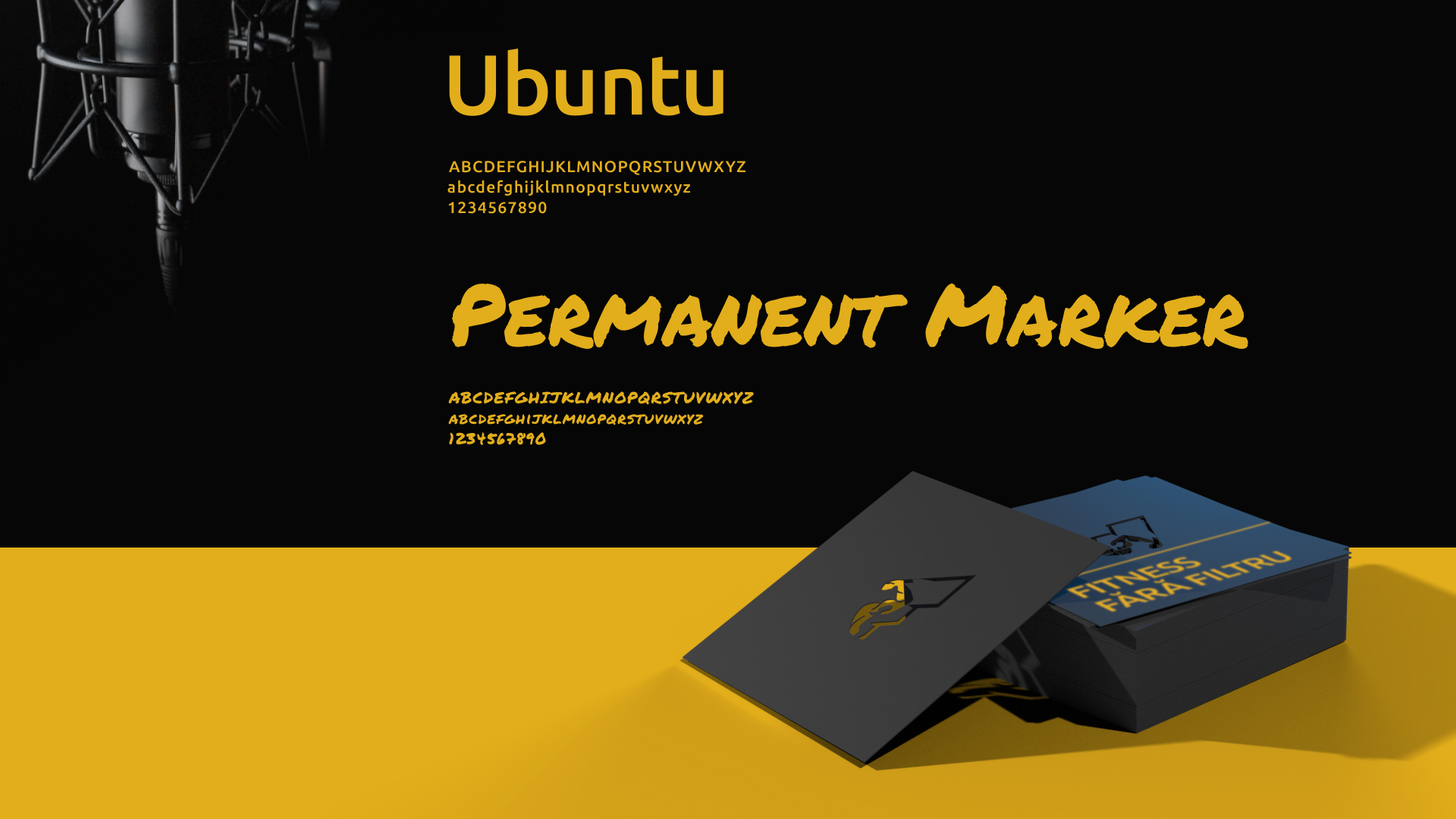
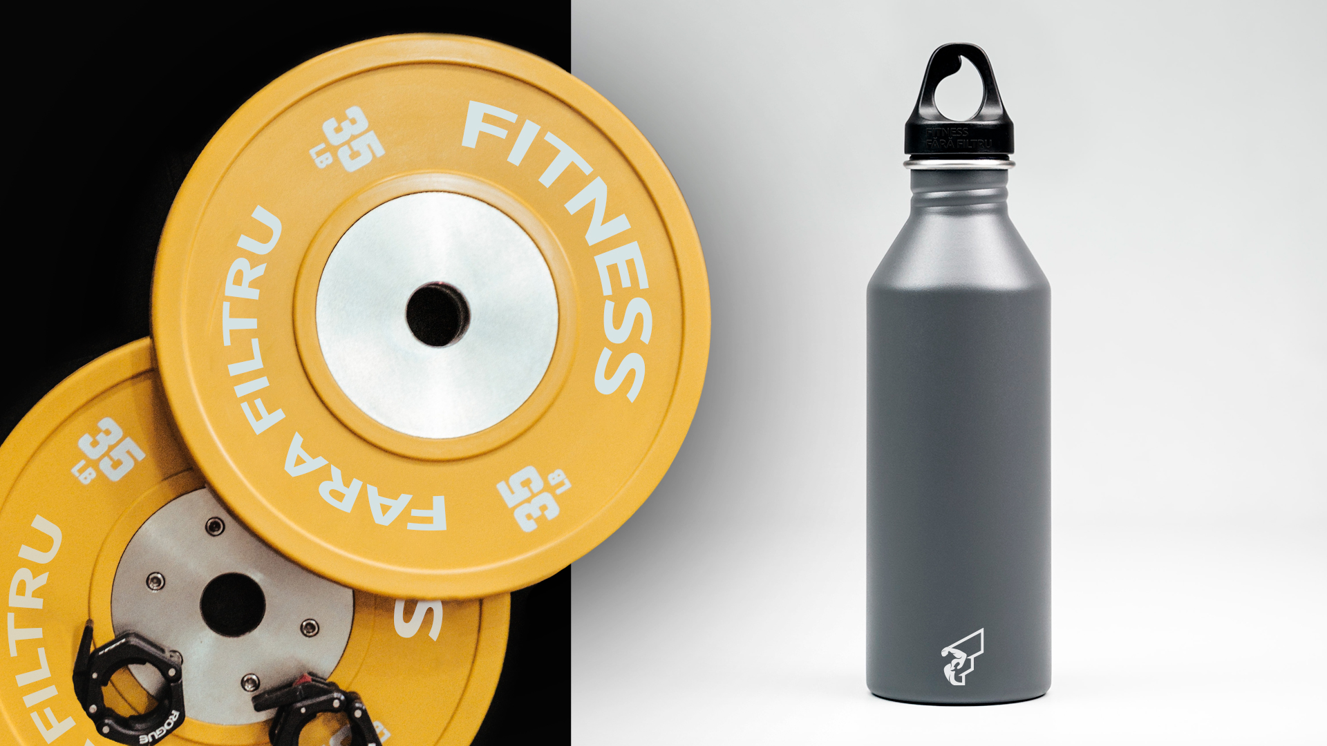
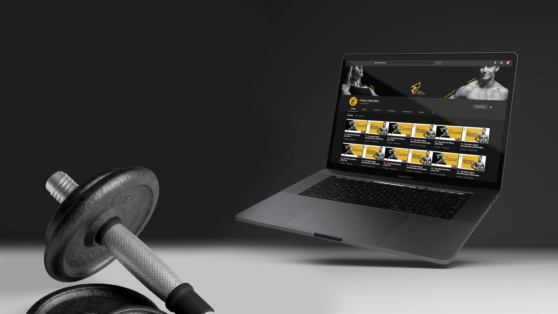
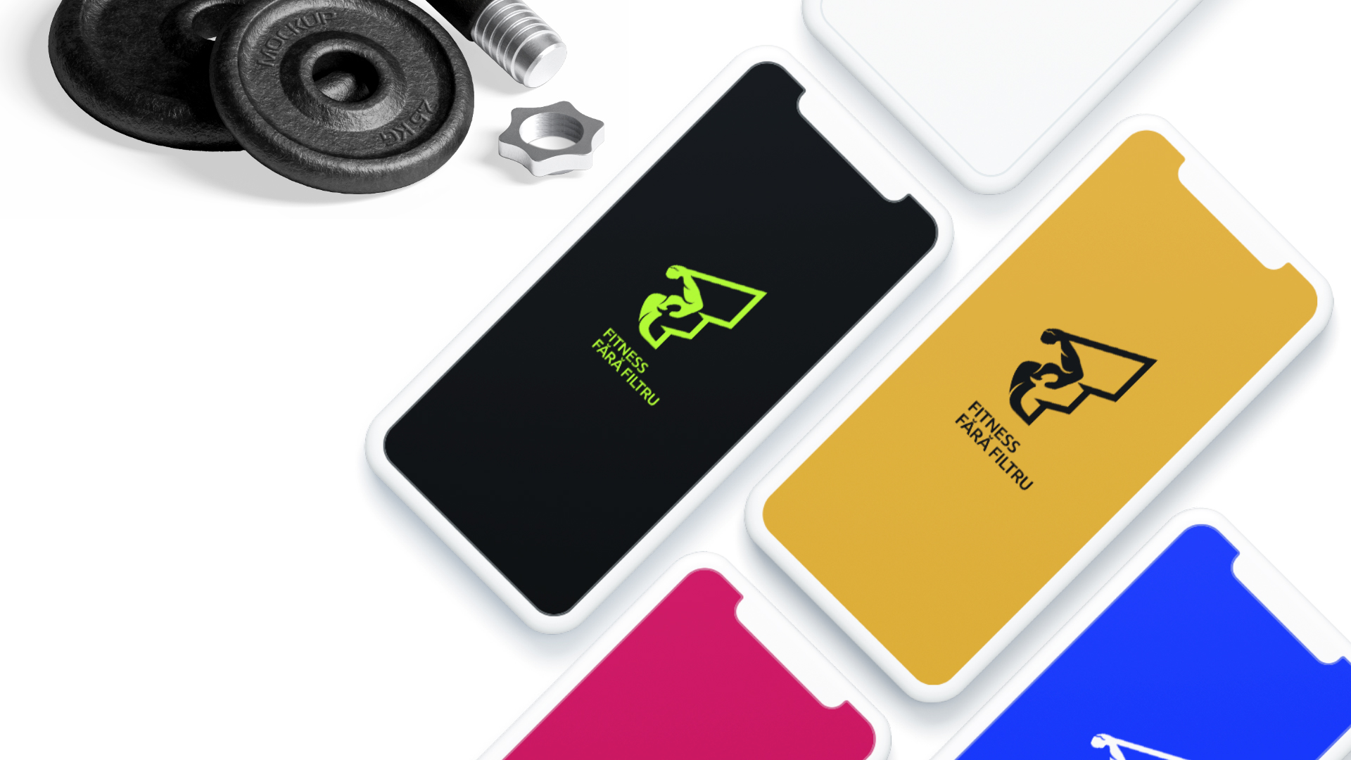
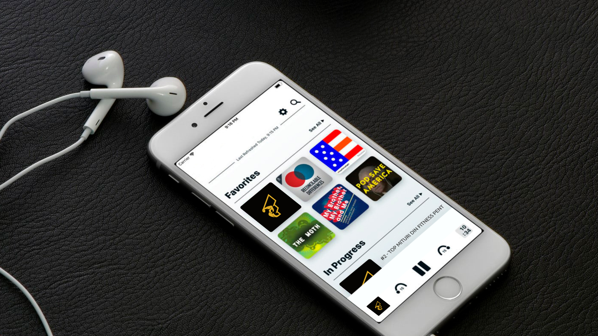
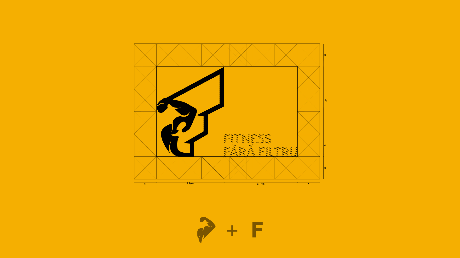
Fitness Fără Filtru is a project I worked on closely with one of the co-presenters, Ciprian. The idea behind this podcast is that it brings forward nutrition and fitness information that is not easily accessible to people, and presents it in a way that everyone can understand. Working side by side with Ciprian has helped my creative process as communication and constructive feedback are key when designing the visual identity of a brand. The main colours of the brand are powerful and contrasting which denote the perseverance and motivation that one needs when trying to change their life for the better and get into a healthy routine. I wanted the logo to symbolise strength and flexibility, two qualities that a person's mind needs when embarking on such a journey.The letter F represents the idea of 'podcast', of something being broadcast, and also, the initials of the title, while the element of human anatomy expresses the main theme behind it, 'fitness'. All those combined ended up creating a cohesive brand identity

